Back to results

HOME CARE / SUPPORT SERVICES

Westmere Care at Home website case study

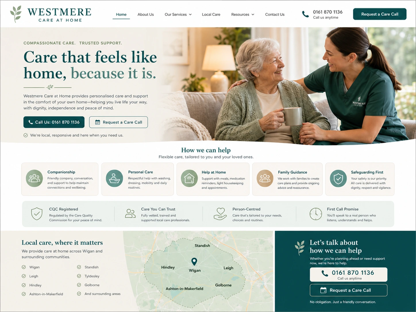
Westmere needed a warmer and clearer website for home care, companionship, personal care, and family enquiries.

Westmere Care at Home website case study screenshot

Care enquiries became more reassuring and easier to start.

Families contacted with clearer needs and more confidence about asking for help.

Before

The site listed care services but did not give families enough guidance around suitability, first steps, and what support could look like.

What changed

We restructured care services, added family-focused guidance, improved trust copy, and clarified first-call expectations.

Result

Families contacted with clearer needs and more confidence about asking for help.

Buyer hesitation

The balance between practical and warm is genuinely difficult for a care service. Too much process detail and the site feels cold. Too much warmth and families cannot find the answers they actually need.

Similar problems come up across most home care / support services websites.

If the before section sounds familiar — unclear pages, passive contact routes, or buyers who do not know enough before they enquire — that is what this service is built to fix.

What the work had to solve

The page structure, proof placement, and enquiry route were shaped around the specific buyer hesitations and practical gaps this business had before the rebuild.

Project requirements

  • Sensitive family decisions
  • Different care needs
  • Trust and safeguarding
  • First-call anxiety
  • Local care coverage
  • Practical visit expectations
Check Fit

If your home care / support services website has the same problems, the fix is usually the same kind of work.

Send the basics and Pixel Peak will tell you whether clearer pages, stronger proof, and a better enquiry route would make a practical difference for your business.